Saturday, January 28, 2017

Week 4


Read Drawing with Pen, Types of Shots (1&2), Silhouettes in Storytelling (100 Tuesday Tips)

Read Chapter 3: Light and Form (Color and Light)

Read pgs 68-75, 96-105, 129-133 (Graphic LA)


From the book, Color and Light, I learned that light and shadows are always coming from everywhere. In the book, it talked about many types of light and shadows such as reflected light and shadows, light and shadows that are coming from different direction, and so on. I do love learning about lights and shadows because they are the most essential factor to make my drawings more alive.


van gogh starry night에 대한 이미지 검색결과

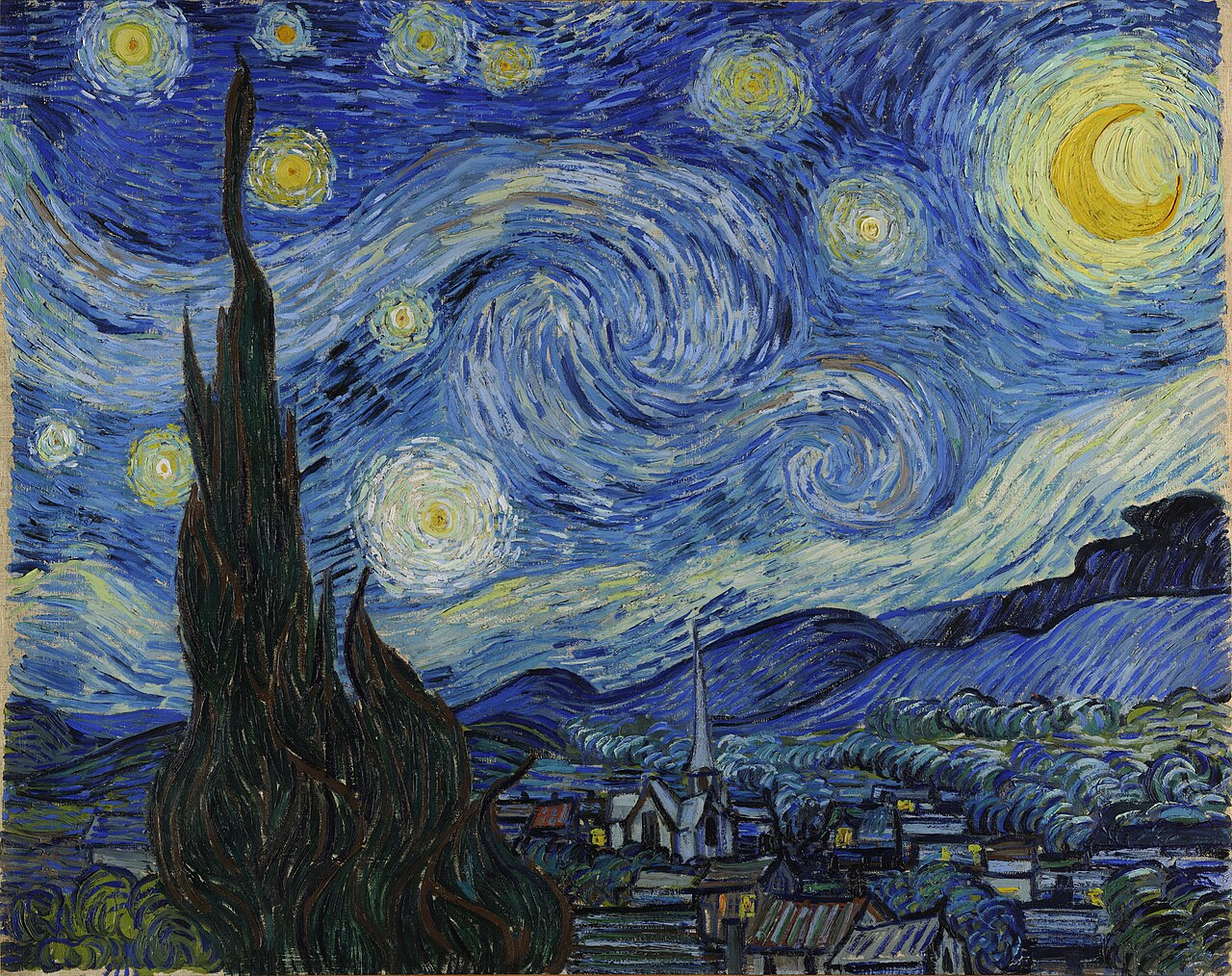
by Van Gogh - Starry night


van gogh starry night에 대한 이미지 검색결과

by Van Gogh - Cafe Terrace at night


From the book, Graphic LA, I learned that shapes are important again, and composition, arranging drawings is also good thing to know. Sometimes simplest shapes are the best, bold shapes are the best, and never judge my drawings but draw first! Before I jump in to draw, I need to always first explore my thumbnails thinking about compositions, values, tones, and so on.


sunmininn에 대한 이미지 검색결과

by Sunmin Inn

Look at that composition So great!

Tuesday, January 24, 2017

Week 3

Read Composition 101, Thumbnails (100 Tuesday Tips)
Read pgs 18-37 (Graphic LA)


        What I learned today is that thumbnails are always important before I actually draw and paint. With possibilities, I first have thumbnails as many as I can because they will lead me to the actual idea. Thumbnails are always small and quick, and after I pick some that I like to develop, then I can actually design them for final composition. In class, we always do a quick thumbnails for every class with different theme. I think it really helps me to come up with any idea quickly and develop my sense of artist. Also, shapes are always important and values are important as well. And, when simple areas are contradict with complicated areas, the visual design looks better than just busy or just that simple.  


Friday, January 20, 2017

Week 2; start of the color journal

Read Chapter 1: Tradition (Color and Light)

Read pgs 5-17 (Graphic LA)


In Color and Light, I learned that from ancient to the modern, artists put color and light on the top of everything. With figures or even environments, they put color and light on the most important step because they are the most important features to make pictures look realistic. From environments to something magical and fantasy, color and light are the most essential factors in pictures to make them alive.


These are some examples from the book.


For the Graphic LA, what I learned is that I need to start my drawing with a simple shape, keep the value contrast, and then go for details later. As long as I keep my shapes, values, tones, then details are not a matter of the design. Also, keeping a tone in a picture is also important.


These are some examples from the book.